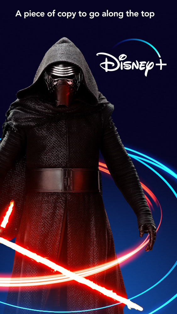
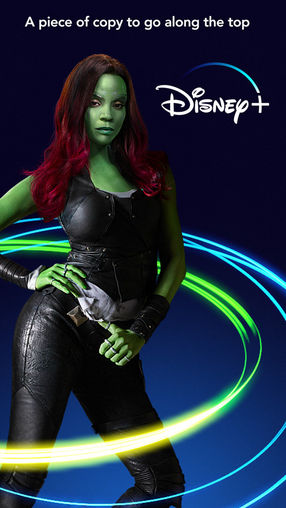
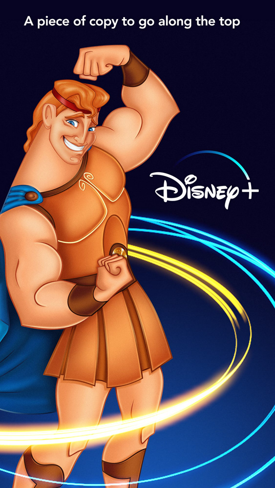
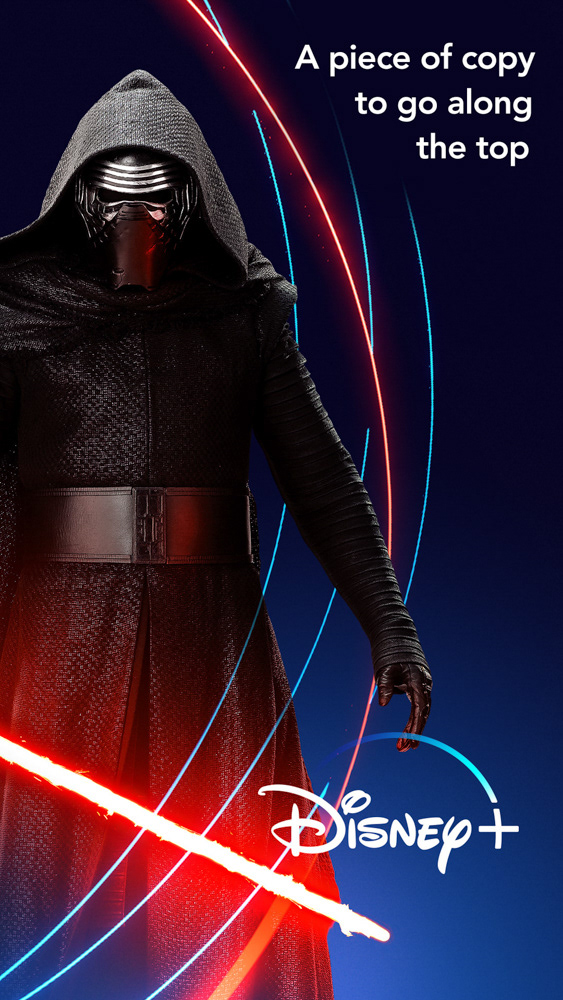
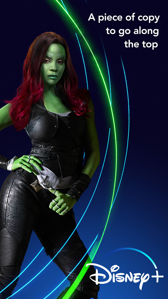
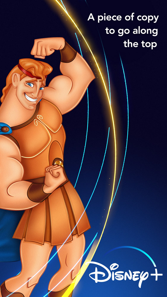
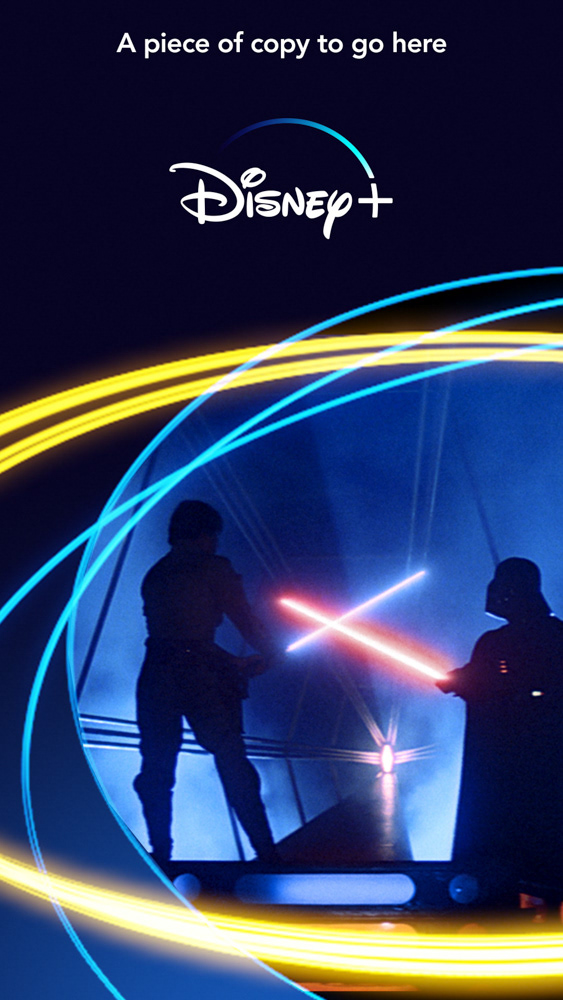
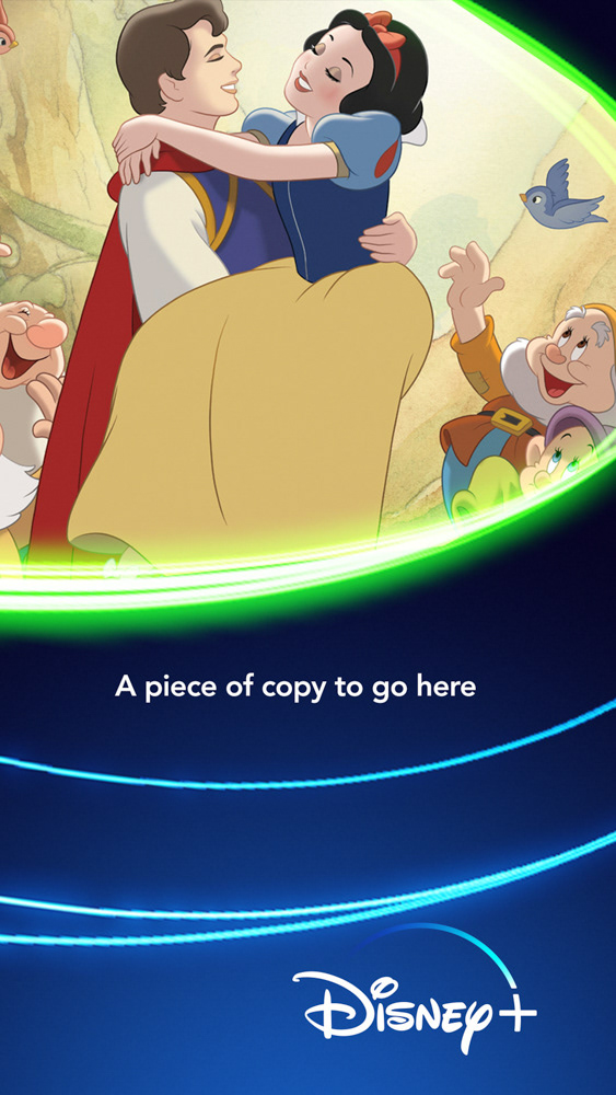
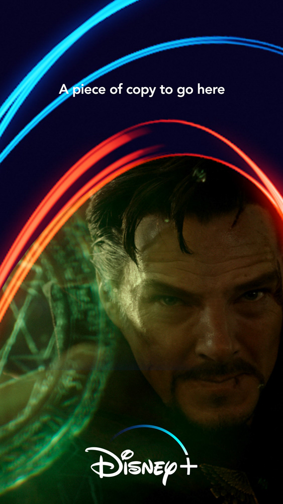
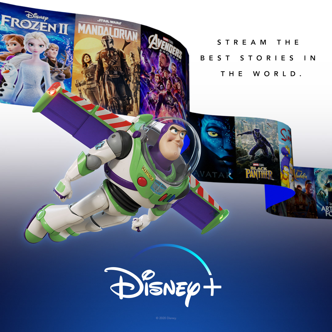
Disney+ BRand (Dynamic Threads)
An anniversary exploration of a possible evolution of the "threads" that were prominently featured in the initial advertising of the service. Like the "+" exploration featured here I was trying to find ways to add more energy, excitement and evolve the preexisting style. Unlike the "+" the "threads" provided a good way to frame not only characters but scenes as well.
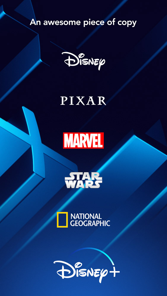
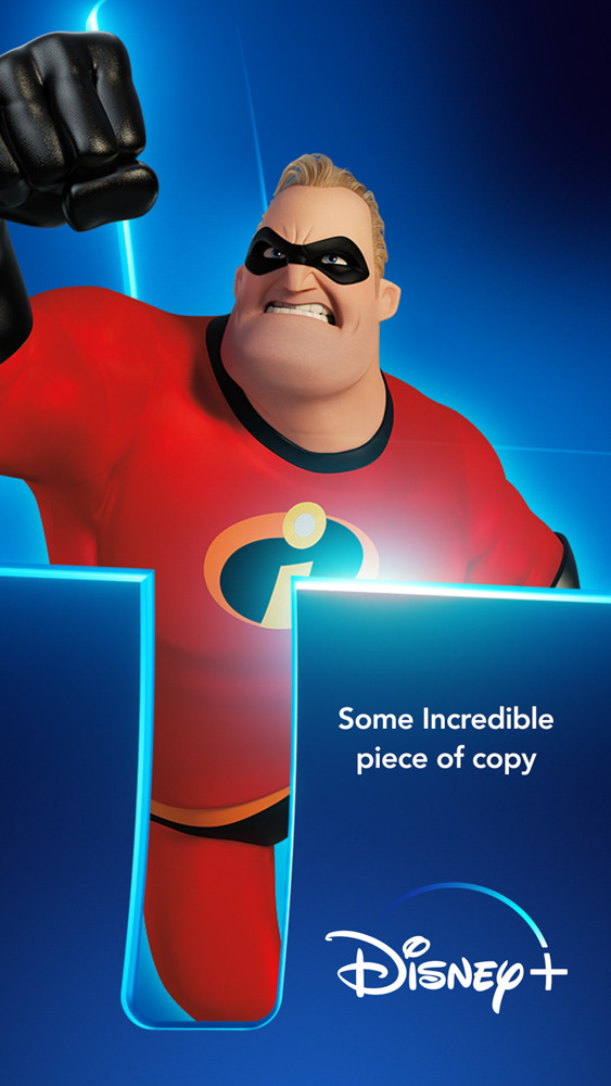
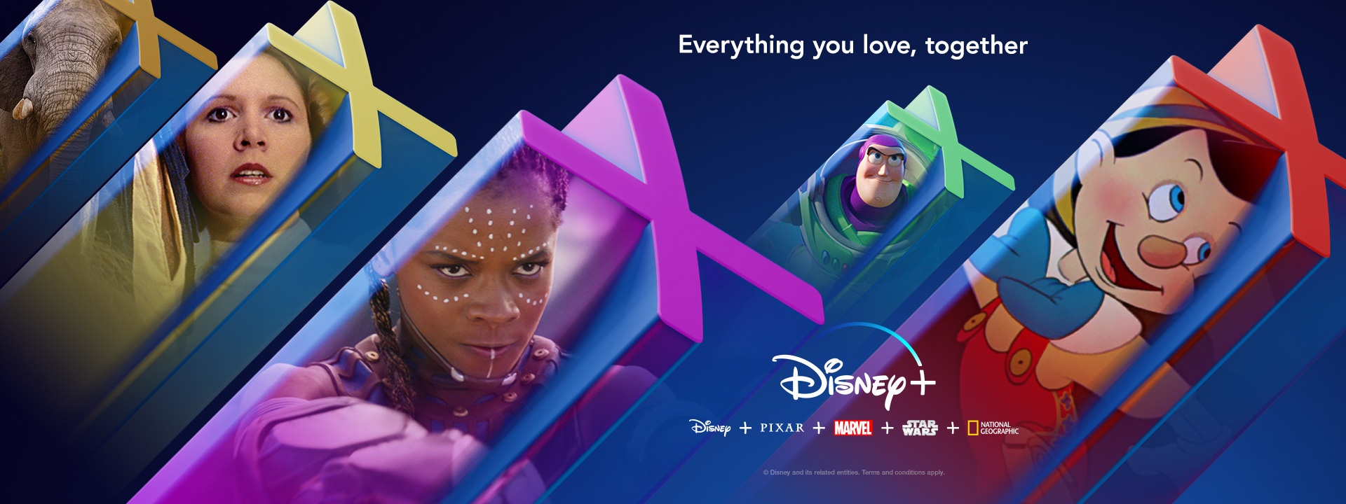
Disney+ BRand (Dimensional Containers)
An anniversary exploration of a possible evolution of the brand of Disney+. Goal was to make the once graphic or flat feel more dynamic and cinematic. At the time the "+" was still not widely used across competitors and could be own-able. Using the "+" provided opportunities to frame or highlight characters and brands featured on the service.
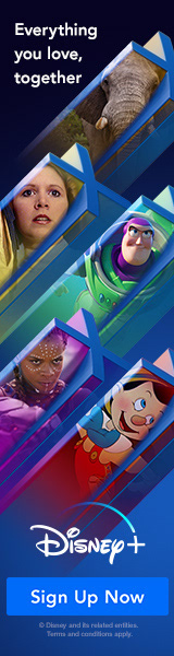
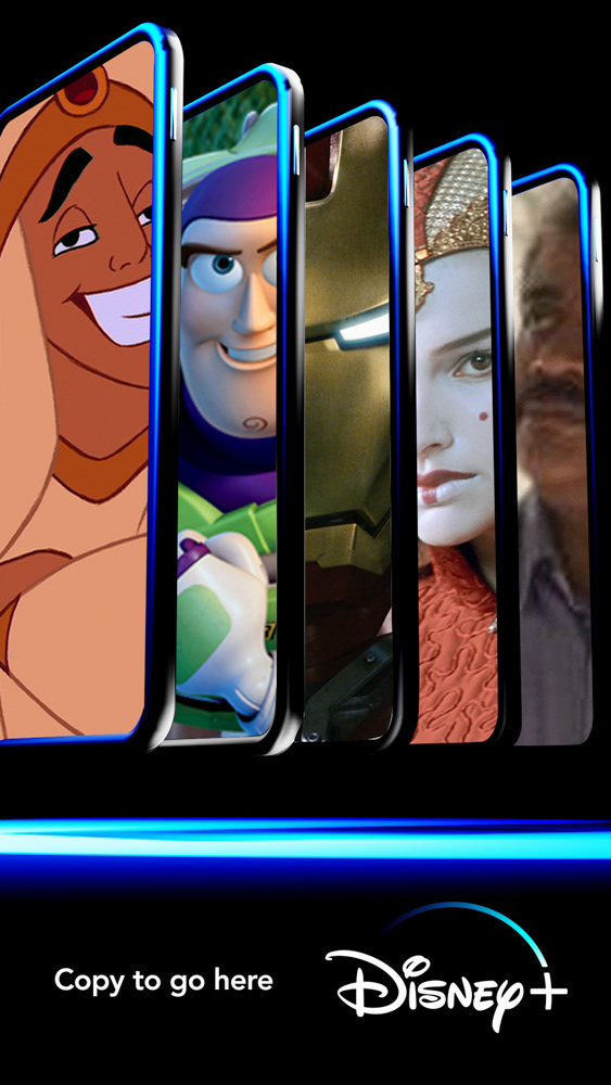
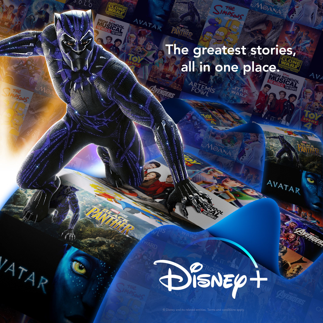
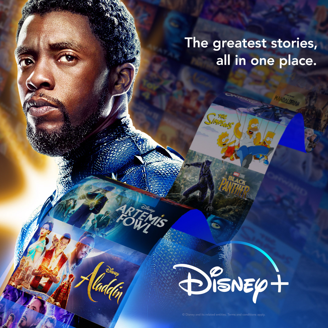
Disney+ BRand (Character Crops)
Explorations on different ways to showcase the brands of Disney+ with playful croppings of the iconic characters and places one can discover on Disney+. This creative was meant to compliment some motion advertising.

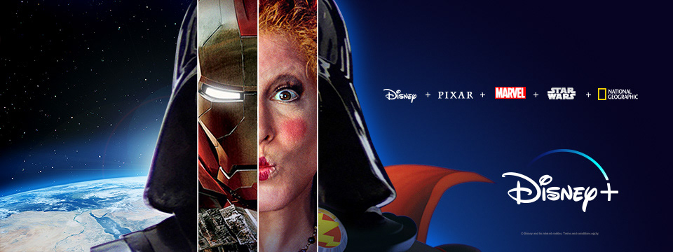

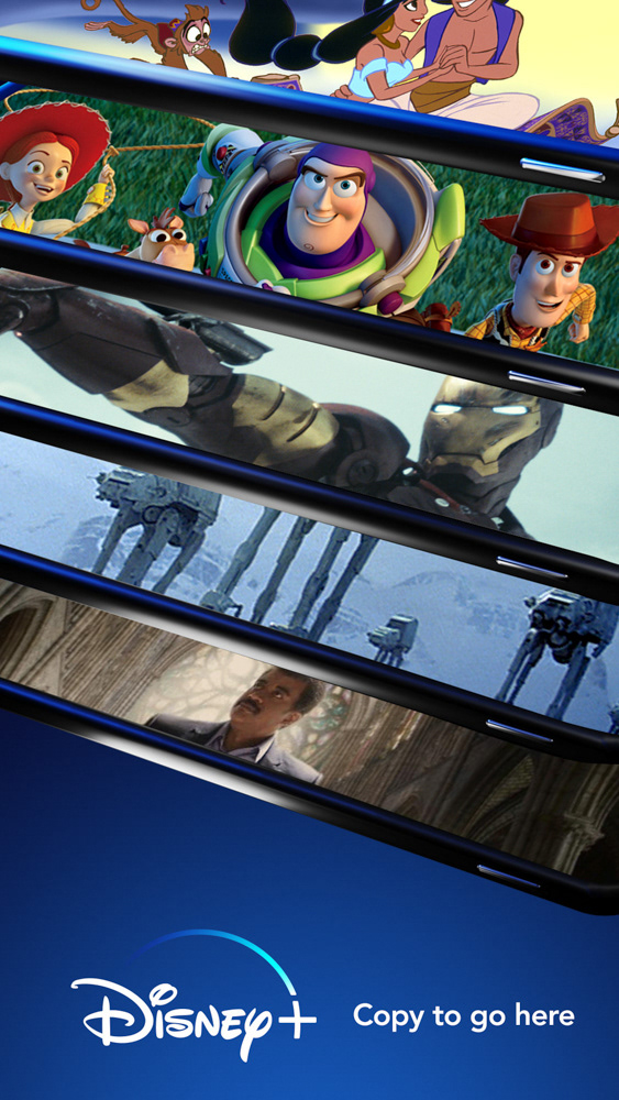
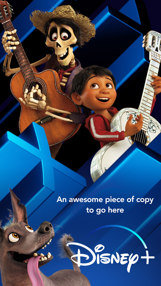
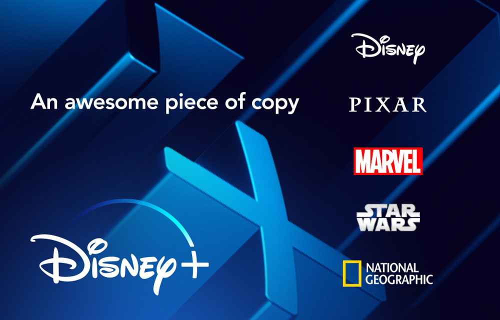
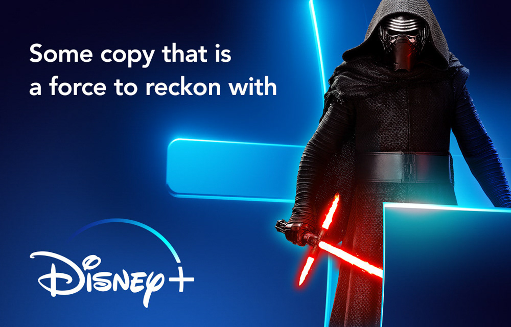
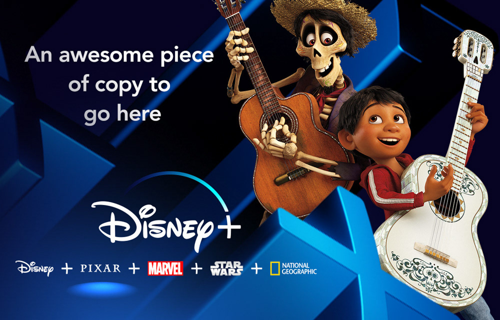
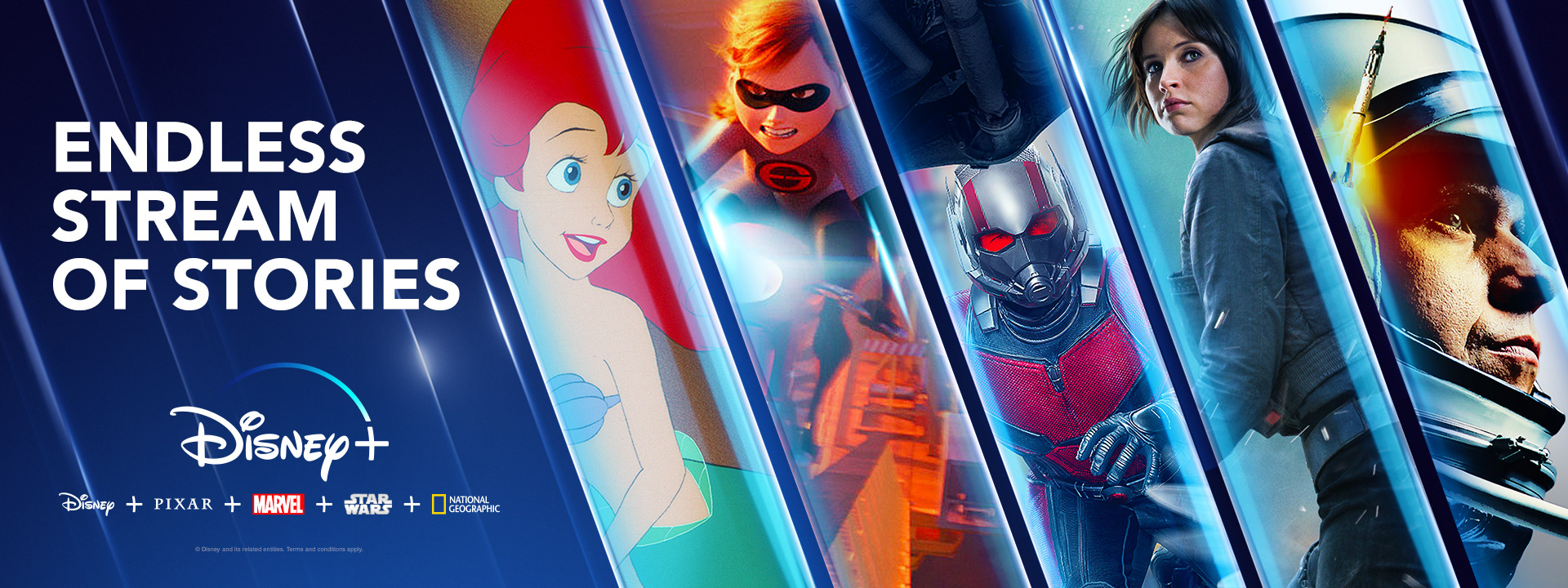
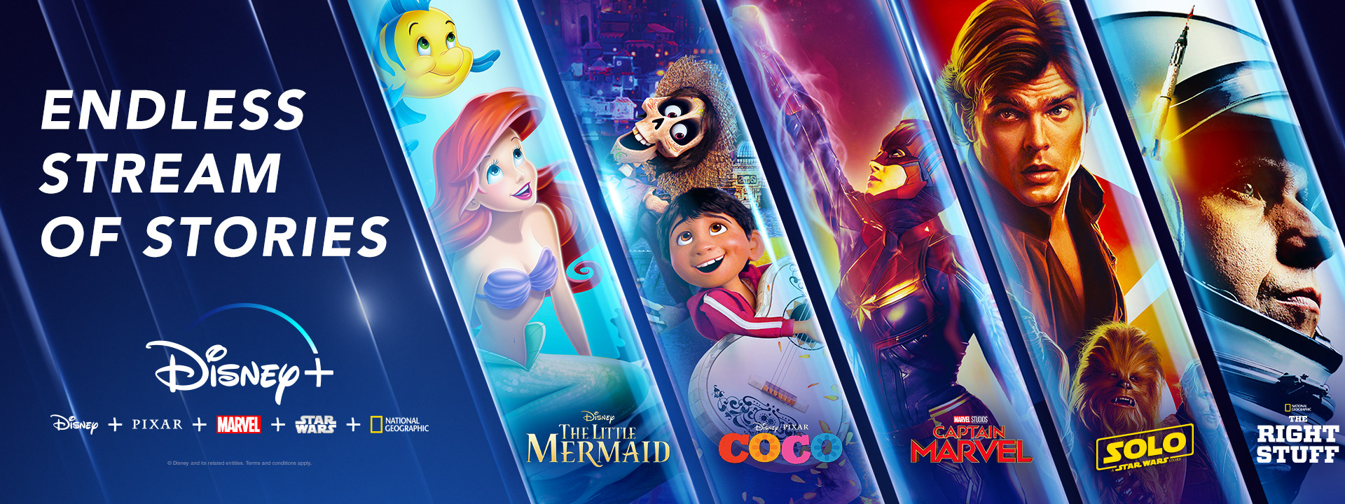
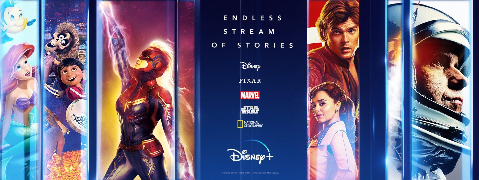
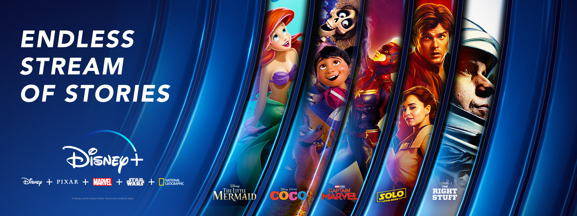
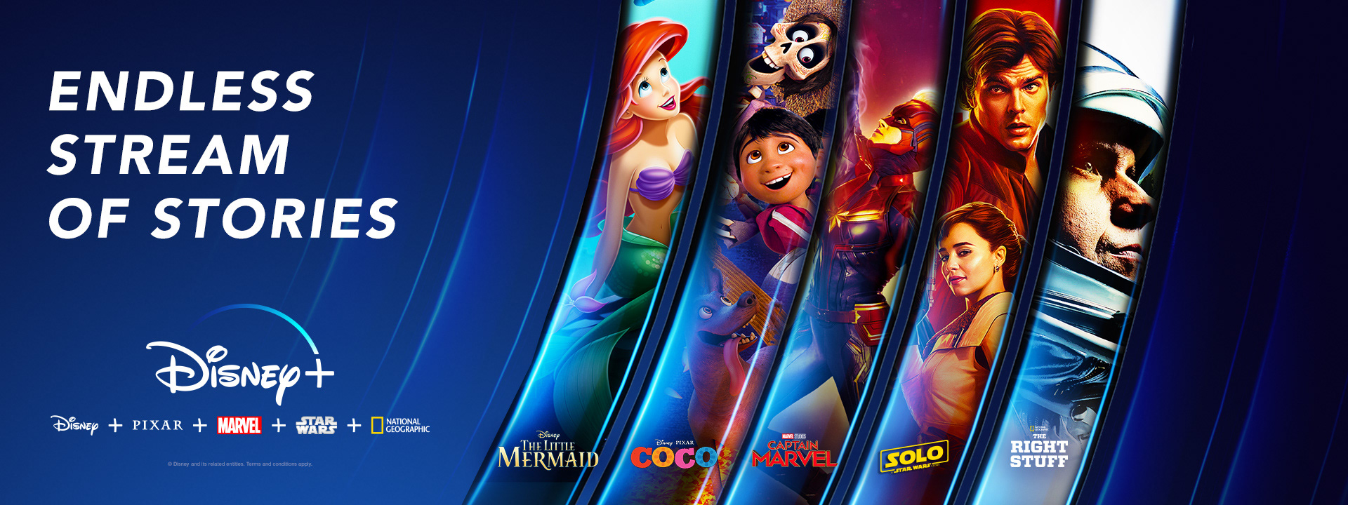
Disney+ BRand (Dimensional Slices)
Dimensional explorations of their sliced design aesthetic used to showcase their five brands by highlighting scenes or characters from that brand. A two dimensional aesthetic is what was running at their launch and continues in variation today.

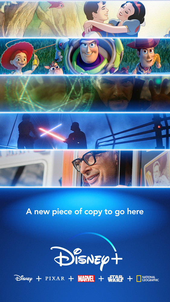
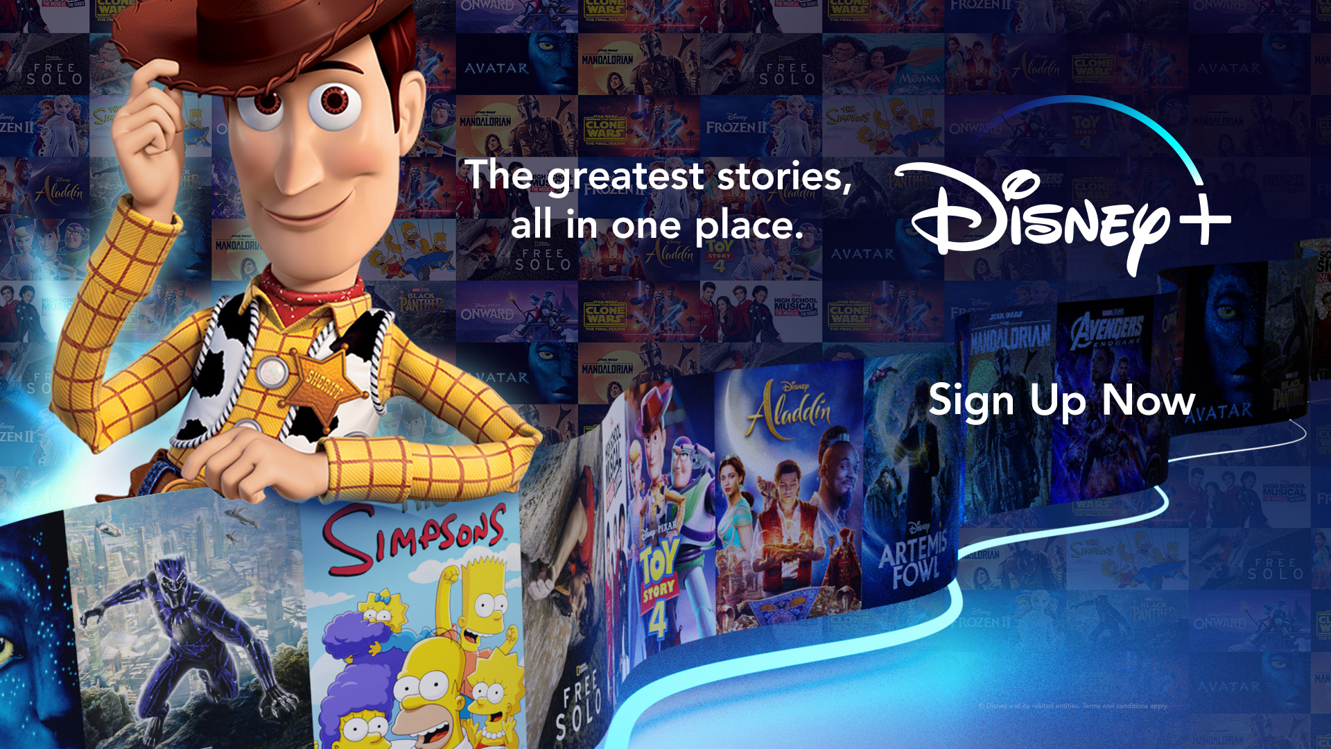
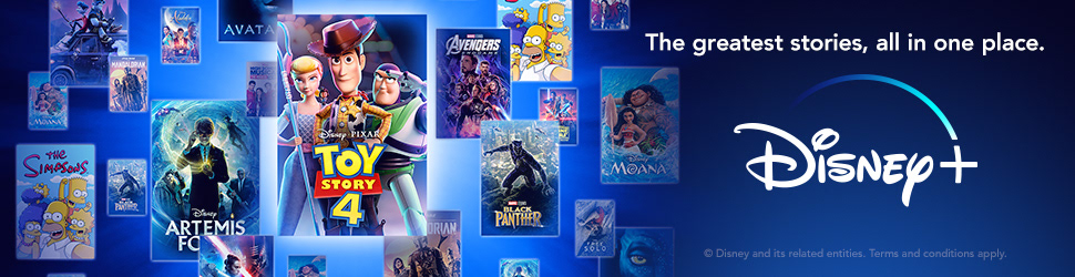
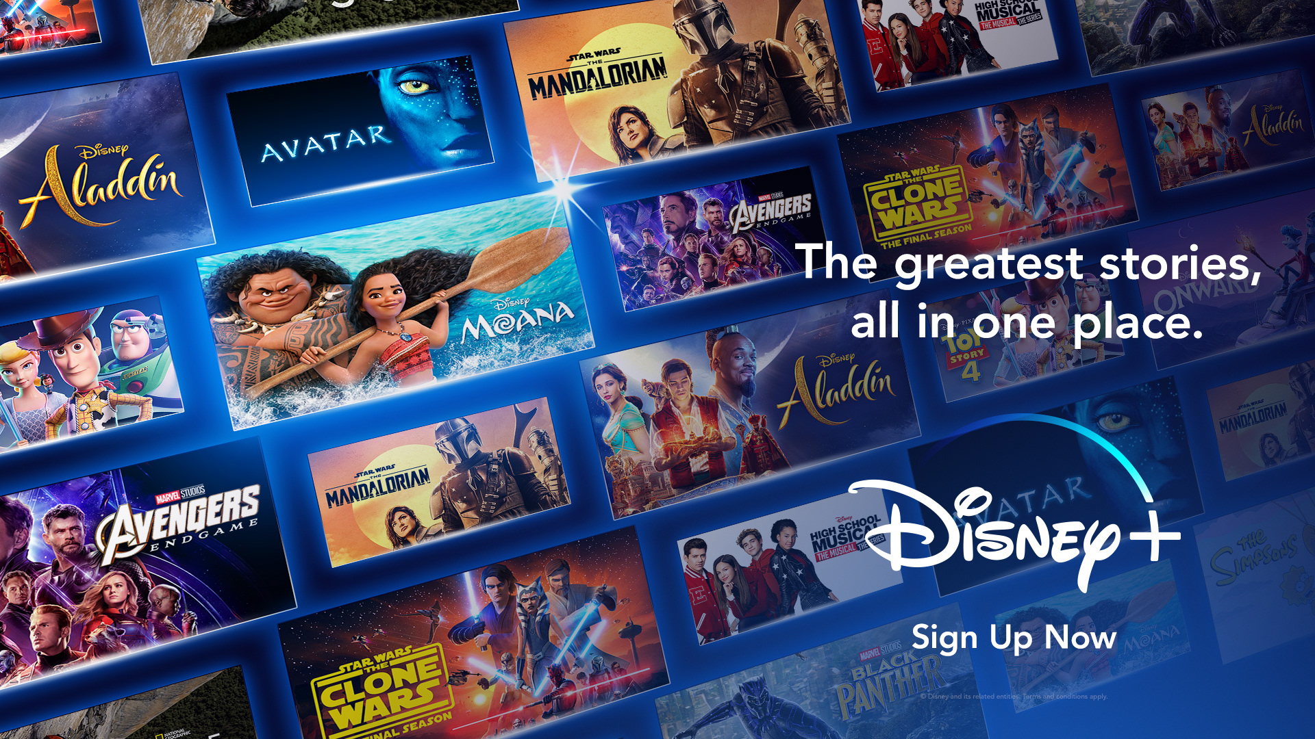
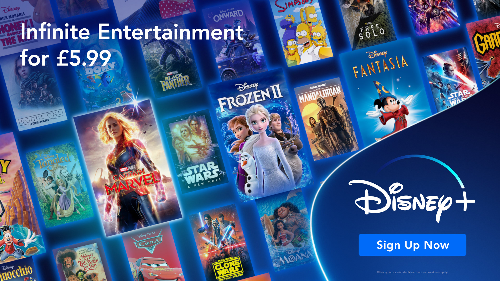
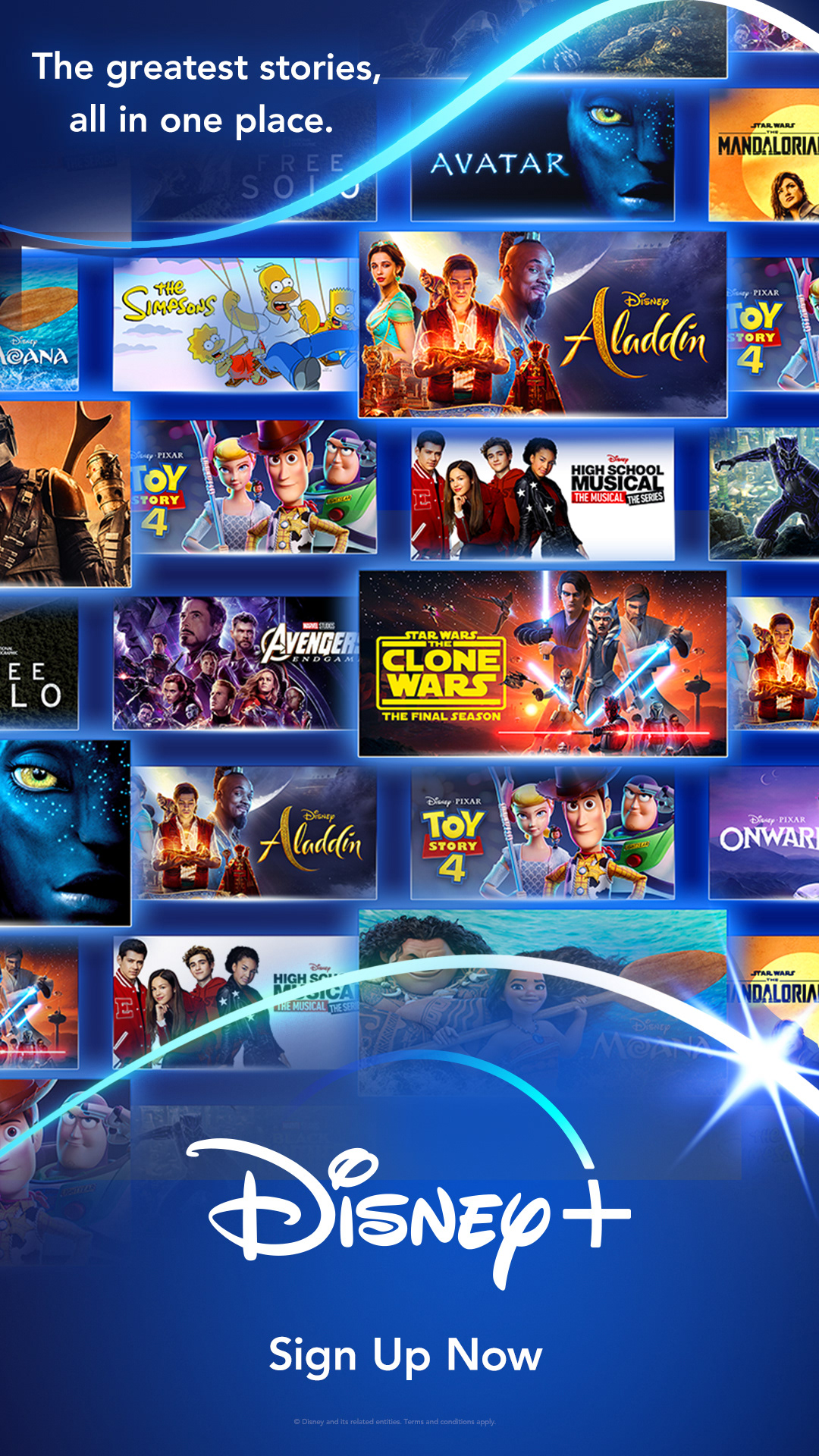
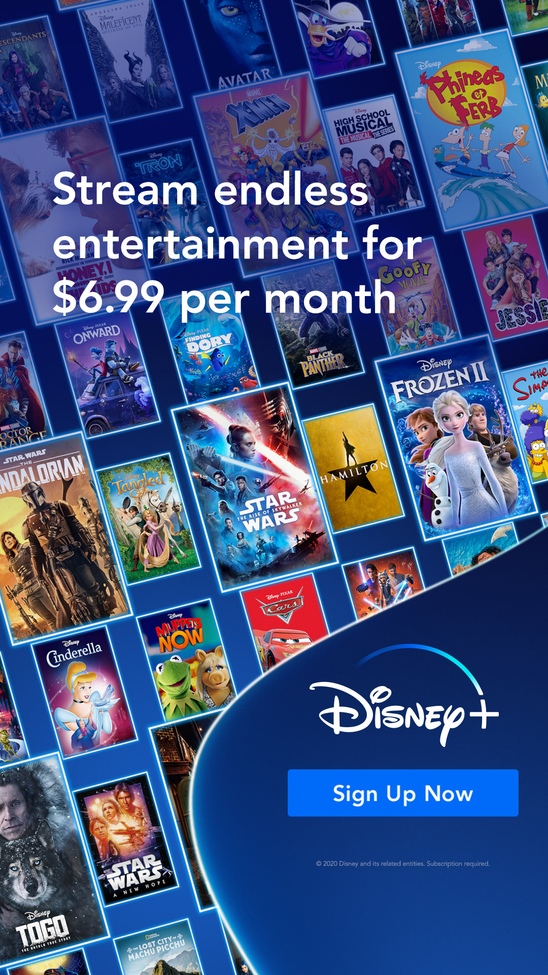
Disney+ BRand (Breadth of Content)
Rather than just show the five brands there are instances that we want to show more diversity and a greater amount of available titles. Below are several experimentations. In some cases we may want to highlight a specific character or title. The static development influenced the motion build included here.


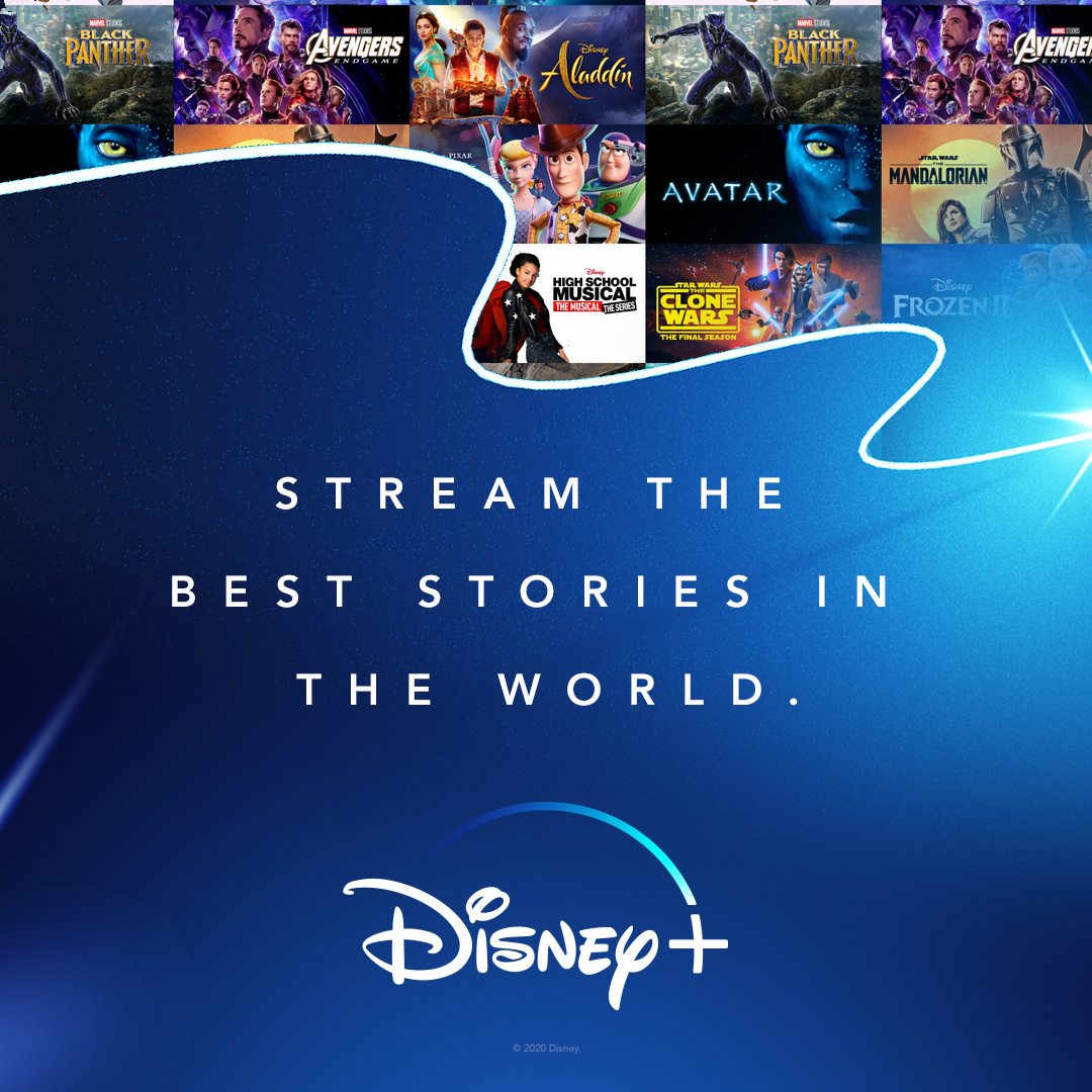
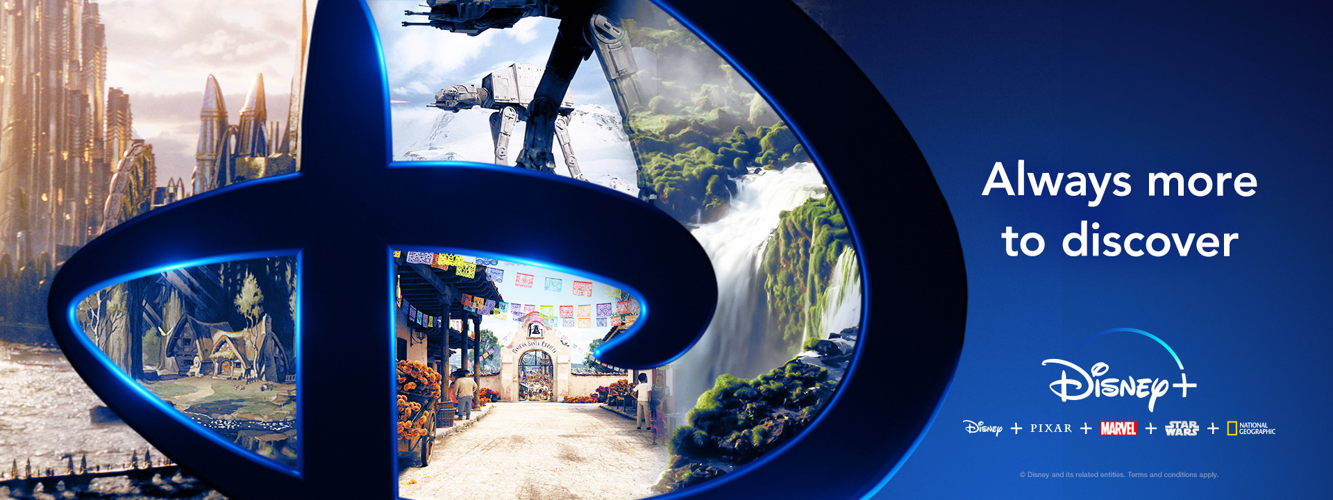
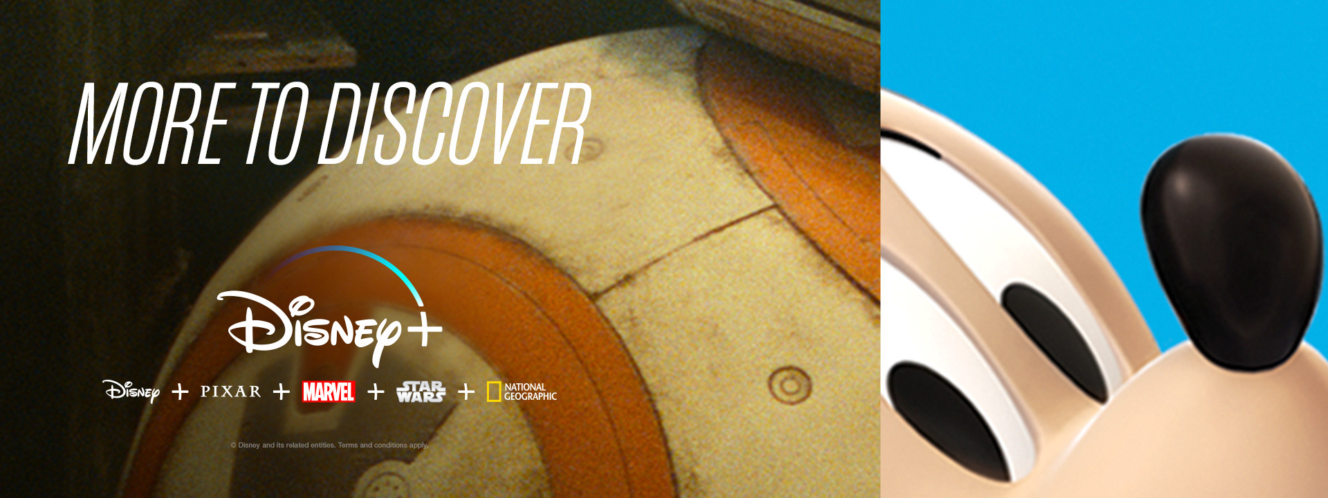
Other
Several more examples of different ways to evolve, explore and highlight the brands of Disney+. There are explorations of using devices as containers as well as locations vs characters to advertise the service.